Xtra Coffee.
We developed a visual identity, tone of voice, and packaging system that reflects their minimalist, science-first philosophy.
Scope
Client
Duration
Year
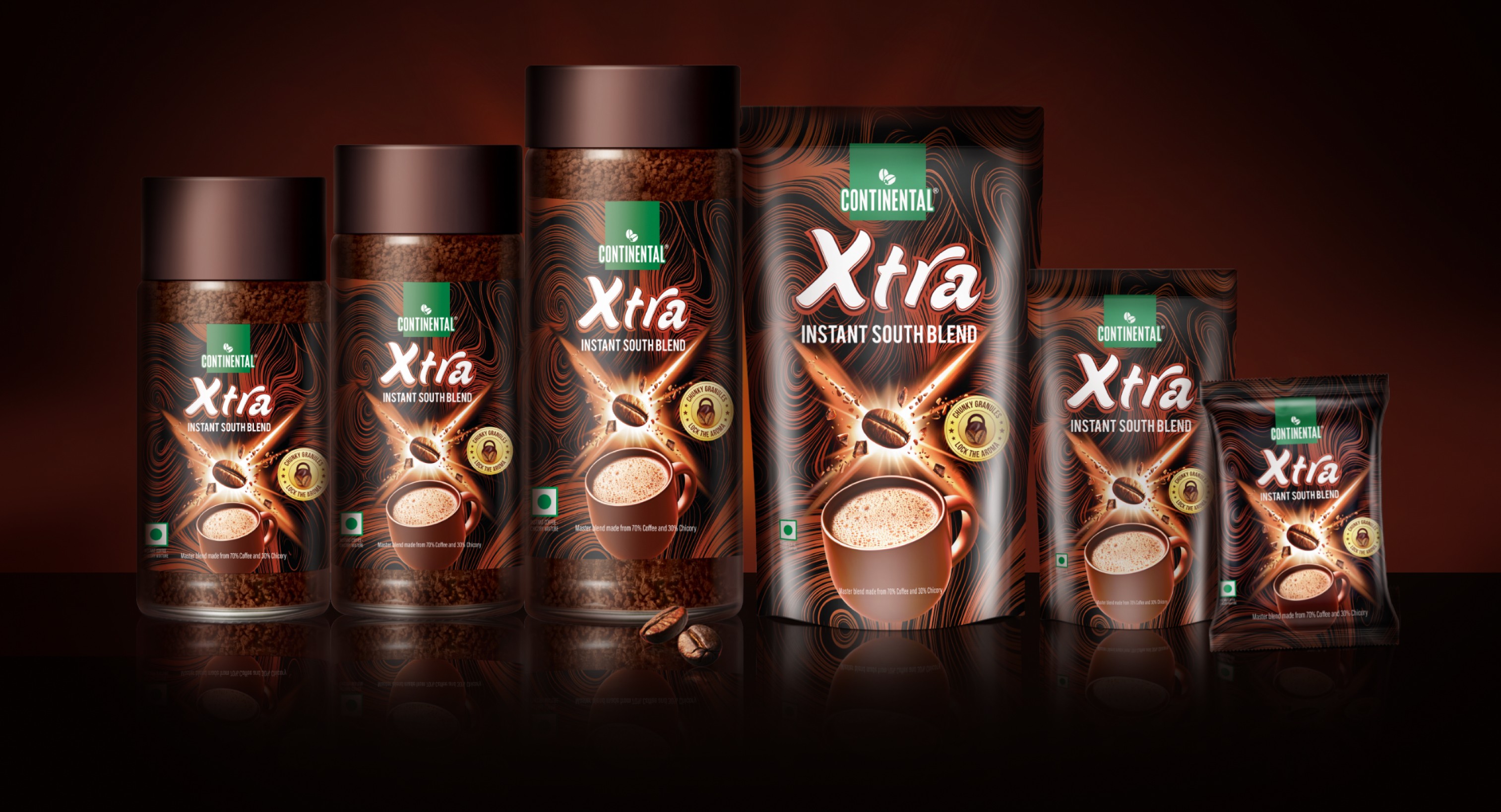
Xtra is a leading brand in the South Indian blended instant coffee market. While its packaging enjoyed strong consumer recognition, the brand's unique selling proposition – "strongest instant coffee" – was not effectively communicated. The brand aimed to reinforce this USP without drastically altering the established packaging that had fostered consumer recall over time.


We built a brand system from the ground up.
The front of the packaging now features an explosion of coffee beans, accentuated by a “blast” motif inspired by the brand's logo (X). We also redesigned the coffee mug to be more prominent, enhancing both relatability and impulse purchases at point-of-sale. The front-of-pack seal clearly articulates the reason-to-believe: Chunky granules lock in the aroma. The background pattern has been enhanced to visually depict the mixing of coffee and milk. The back of pack carries the same design look, with mnemonics on coffee preparation and product story.


Emphasising the coffee's strength through readily identifiable visuals and mnemonics would effectively convey the brand's core message.
Post-launch, their direct-to-consumer growth rose, driven by stronger visual recognition and customer trust.

A curated selection of projects that reflect our commitment to simplicity and purposeful design.

